Neon TV
Premium video streaming service from scratch
Wilson Fletcher
Principal Designer UX/UI
2015
Introducing video on-demand to New Zealand
With the imminent arrival of competitor Netflix, Sky New Zealand was eager to get to market first with a streaming service which would not only have the right mix of content, but also the right experience.
Racking up the frequent flyer miles, we worked closely with the client in their Auckland offices to help them build a VOD service from the ground up.
This exhausting but oh so rewarding project resulted in a digital experience which is both distinctive and immediately intuitive.
User testing
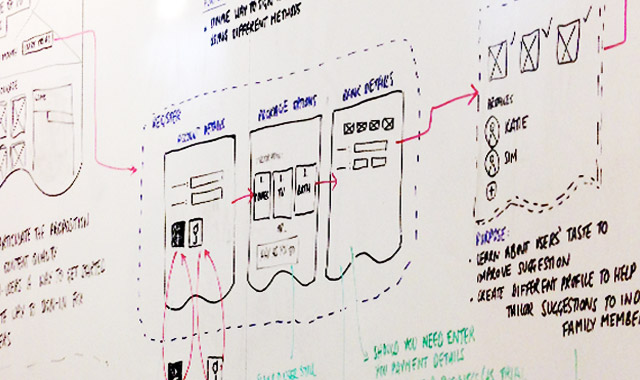
As well as a comprehensive competitor review, early journey maps allowed us to explore the most optimal information architecture.
Prototypes were frequently tested with NZ audiences, giving us insights into not just the experience, but also their content expectations and understanding of VOD.
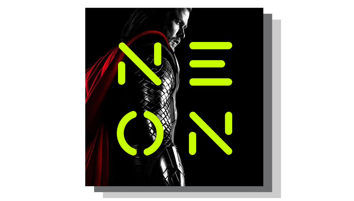
Branding
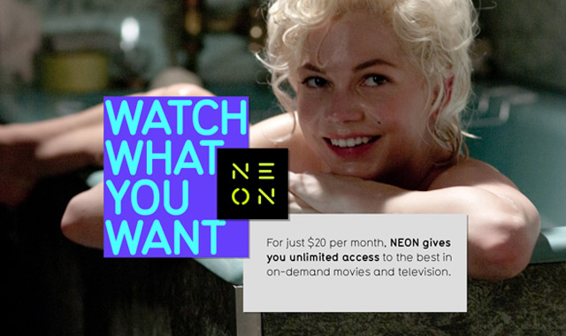
We got the amazing opportunity to work closely with Interbrand Sydney who created a bold and unique brand for this new service.
Our challenge was to translate their visual language into something that could work across a range of user interfaces, would be accessible, and would not steal too much attention.
Service maps
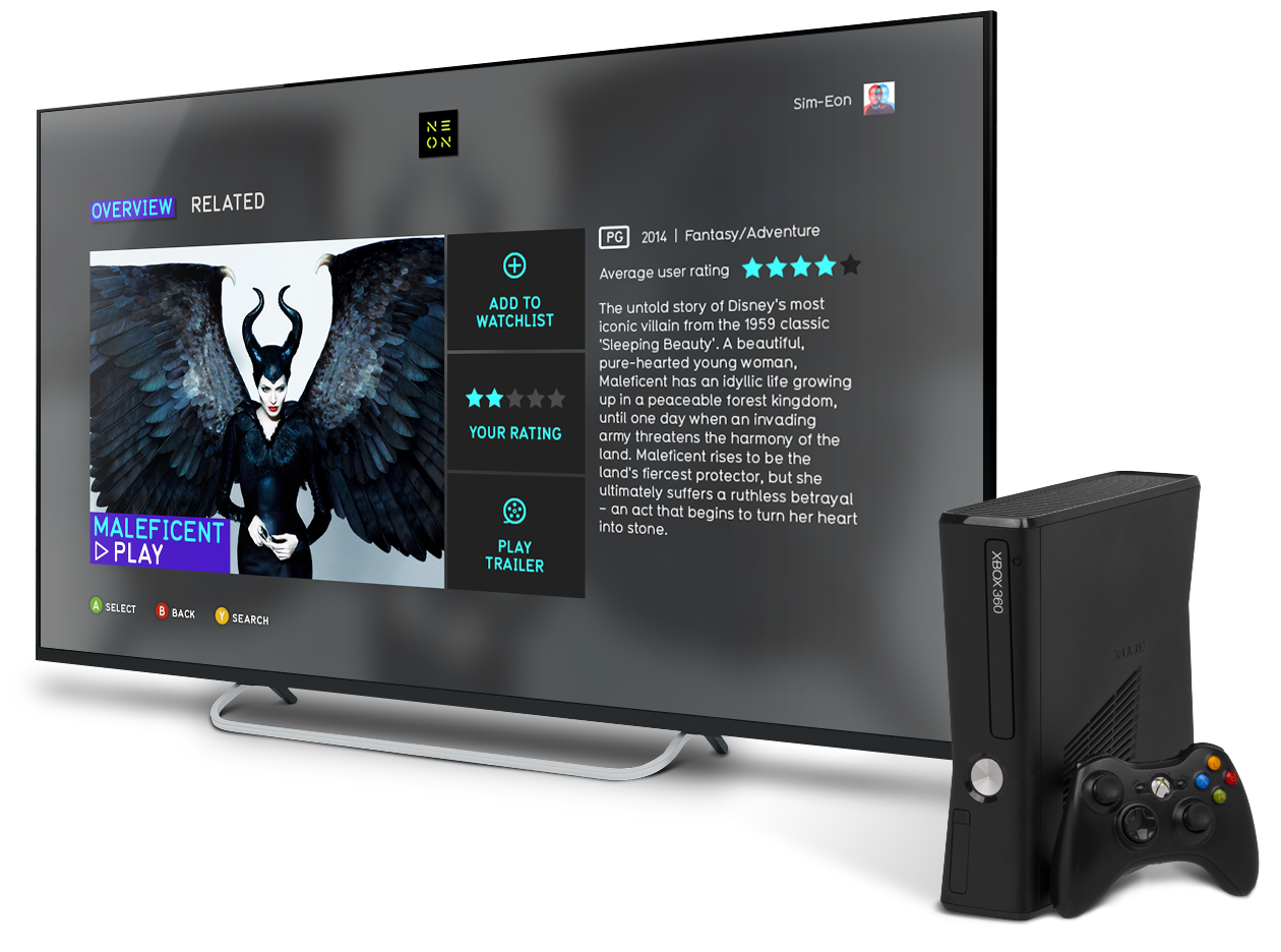
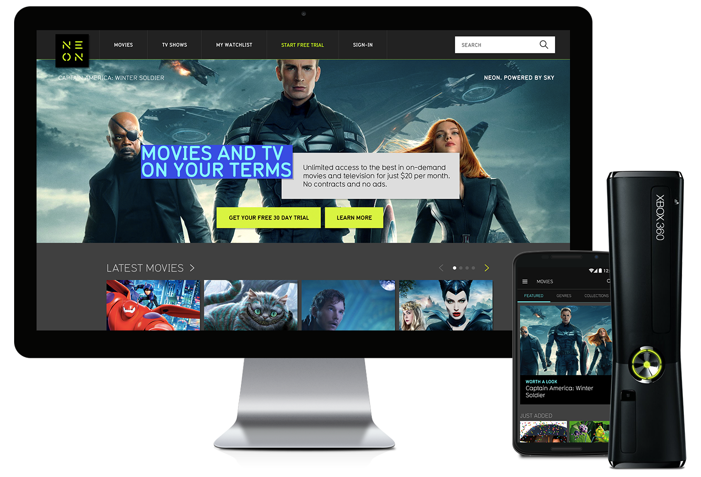
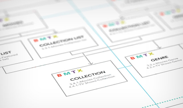
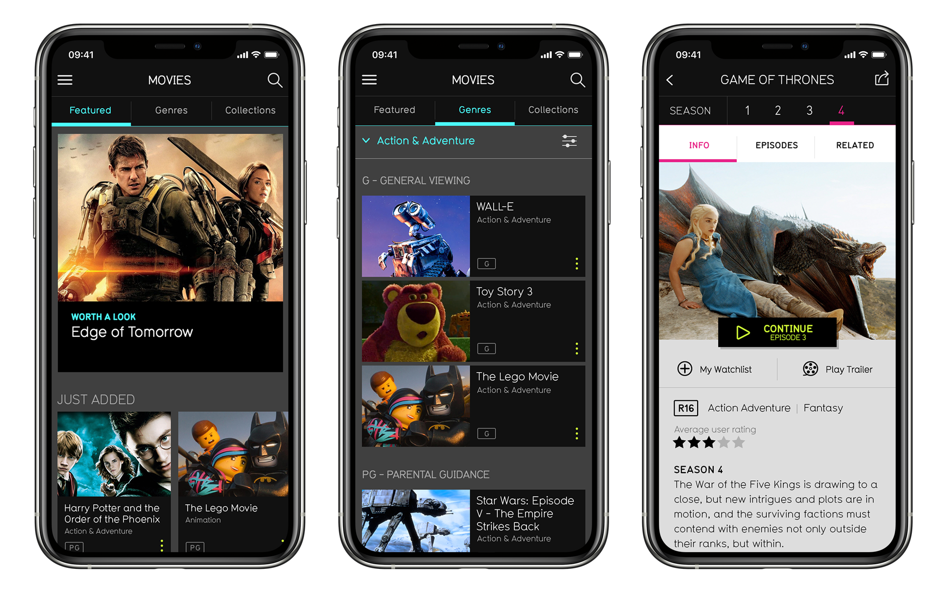
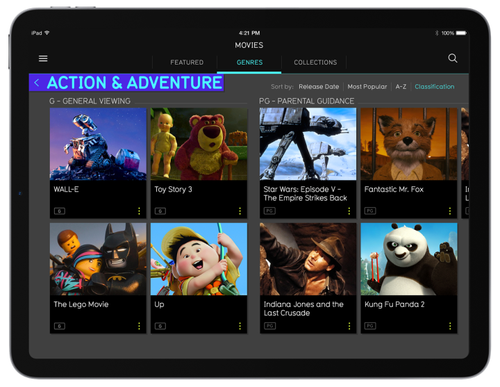
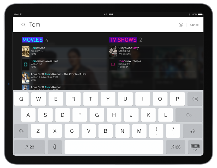
As we were designing for both web, iOS, Android, and XBox, and feature sets varied slightly from platform to platform, an exhaustive amount of wire-frames and service maps were created and iterated on to ensure everything worked as it should.
Content is king
We dedicated significant effort to create a streaming service that was both unique and intuitive. Nevertheless, it’s crucial to acknowledge that the audience’s primary concern always centers around the available content. During user testing, having the SKY licensing team present was invaluable, as their presence allowed them to observe users’ expectations for a premium subscription service like NEON.
Initial research indicated that most New Zealanders primarily associate the Sky brand with live sports content. Given that NEON’s platform is purpose-built for streaming movies and TV shows, a conscious decision was made to exclude the Sky name from the experience. This choice aimed to manage user expectations regarding sports content.
Our initial UI designs featured cover art for the titles, but it led to confusion among many users who thought they had to purchase content separately, reminiscent of Apple’s approach at that time. To align better with popular streaming services like YouTube, which users were more familiar with, we switched to using thumbnail shots.
Everything, everywhere, all at once
We had a multitude of factors to account for when designing the web and app experiences since we were launching on both iOS and Android, catering to both tablet and mobile users. Some account features were exclusively available on the web platform, while certain streaming features performed optimally on the dedicated apps.
Microsoft was particularly enthusiastic about positioning the Xbox as more than just a gaming console. With a set of highly detailed UX and UI guidelines, we embarked on the journey of upskilling ourselves as we progressed. Ultimately, we successfully integrated the complete NEON experience onto the Xbox platform in time for the launch.